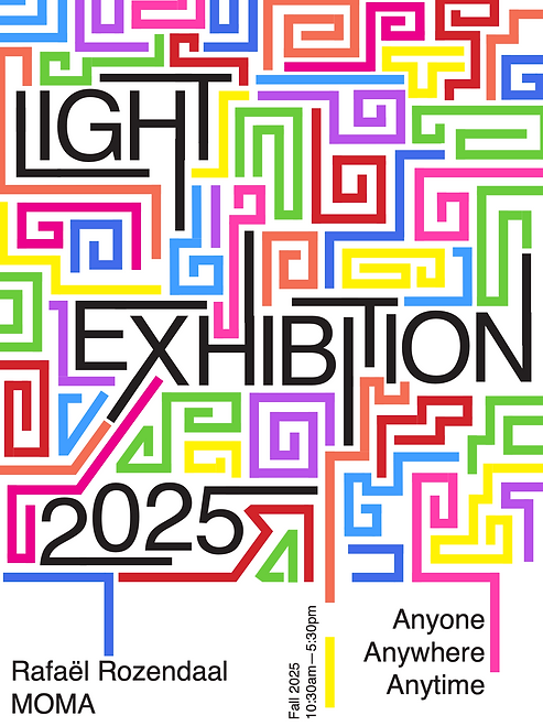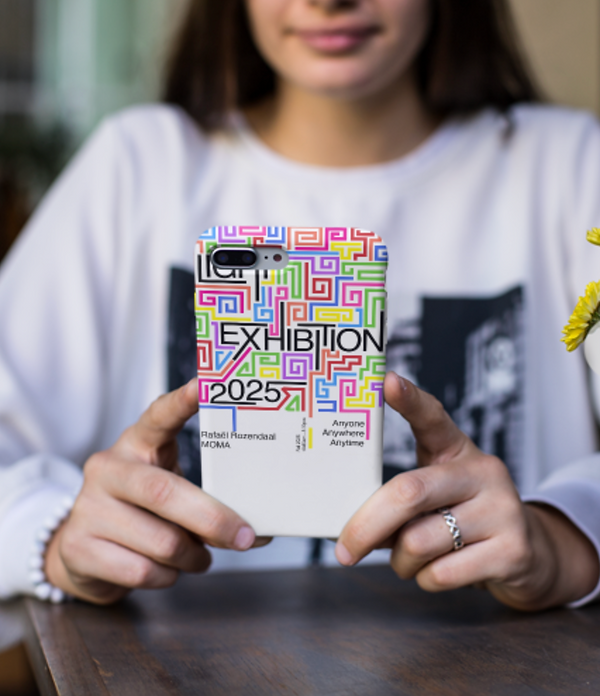
This poster is a visual tribute to Rafael Rozendaal’s Light Exhibition at MoMA, 2025. Taking cues from the artist’s signature use of interactive color, motion, and code, the design translates his digital sensibility into a striking, print-based format.
The typography is bold and central—LIGHT, EXHIBITION, and 2025 anchor the viewer in space, while the intricate maze of multicolored geometric paths reflects the playful, looping nature of Rozendaal’s digital environments.
The repetition of color and form creates a sense of controlled chaos, suggesting motion, exploration, and discovery—key themes in his work. The vivid palette evokes the luminosity of screens and the glow of digital light.


The structured maze elements also allude to pixels and pathways in code, reinforcing the exhibition’s digital DNA.The color palette is vivid and varied, evoking the luminosity of screens and the feeling of digital light. The structured maze elements also allude to pixels and pathways in code, reinforcing the exhibition’s digital DNA.
By incorporating the phrase "Anyone, Anywhere, Anytime", the poster echoes Rozendaal’s ethos of accessibility and universality in art. The overall layout invites the viewer to not just look, but navigate—mirroring how Rozendaal’s artworks are experienced online and in space.
Prototyping


I began with the basics of the Light Exhibition—colors, shapes, and typography. I sketched different layouts, overlapping shapes, and colors to create a harmonious design that balanced key concepts, including essential exhibition information.


In the second iteration, I explored simple shapes and opacity through a scattered, overlapping layout. The third focused on a more organized structure, while the fourth incorporated repetition to reflect Rozendaal’s signature looping style


Afterward, I tried placing the word 'light' in different positions and started to experiment with the colors I wanted. For the first interaction, I tried to connect one sentence throughout the word with not shapes but small illustrations around it.
Motion Graphic
The motion graphic attempts to capture the movement, explosion of colors, and the continuous changes mirroring the effect shown by Rozendaal.
The motion graphic tells a story of elements uniting to form the final piece, with shifting viewpoints of different lines, shapes, and numbers.
Grids and composition have significance in the motion graphic, along with the fast-paced style mirroring Rozendaal's language and speed.


