top of page


1/2


1/1
Cropped
Letter
Typography, Layout
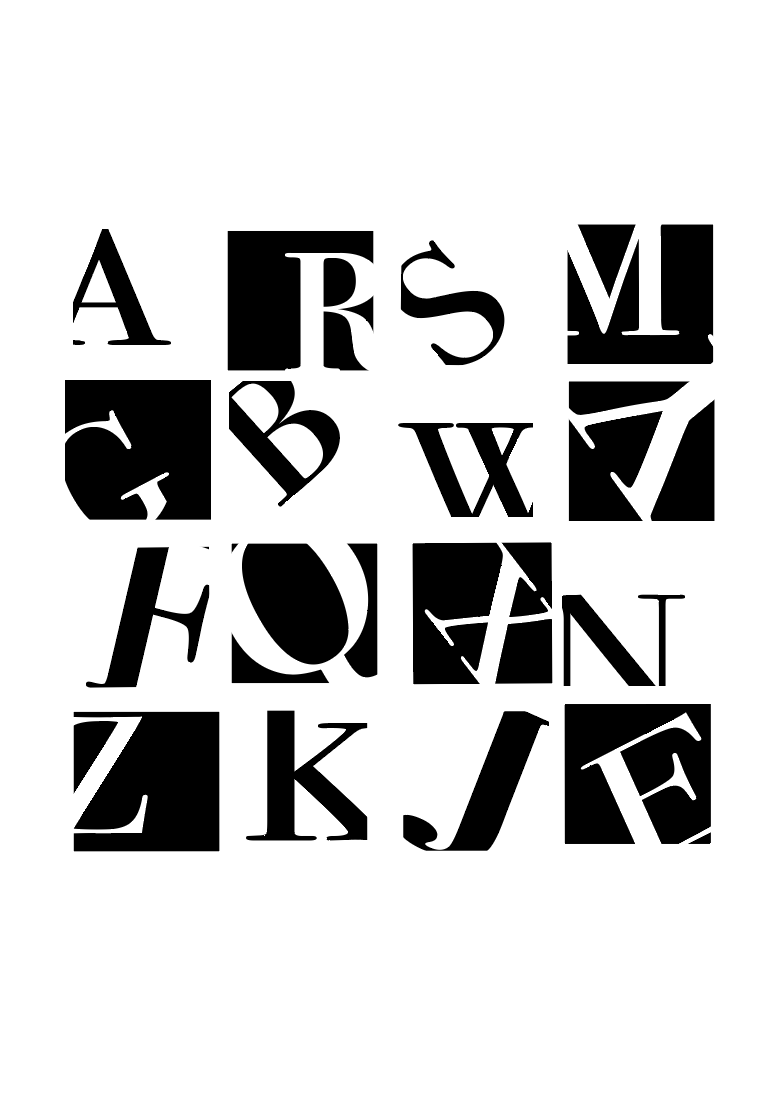
This project marks my introduction to typography and communication design, challenging my reliance on color by working solely in black and white. Through sixteen patterns, I explored rhythm, structure, and contrast using varied strokes and contours.
Some designs convey motion through shifting alphanumeric forms, while others draw from Sanskrit-inspired letterforms. One composition combines four alphabets into a single character, blending legibility with abstraction.
Typefaces used include Clarendon, Bodoni, Helvetica Bold, and Adobe Caslon Regular.
bottom of page